
Coca-Cola Freestyle dispensers can be found all over. This innovative product line lets each customer create their own unique flavor blend and delivers a true one-of-a-kind fountain drink experience. The intranet experience for this product line, however, was clunky and dated unlike the cutting-edge dispensers. The Freestyle team at Coca-Cola reached out to our team to audit the website experience and propose design solutions. This ultimately led to a restructuring of the IA and search experiences that led to improved usability and introduced new critical functionality for internal teams.
Design Team Lead
UX Designer
UX Researcher
1 Designer
1 Project Manager
1 Developer
3 months
Improved SUS score by 48%
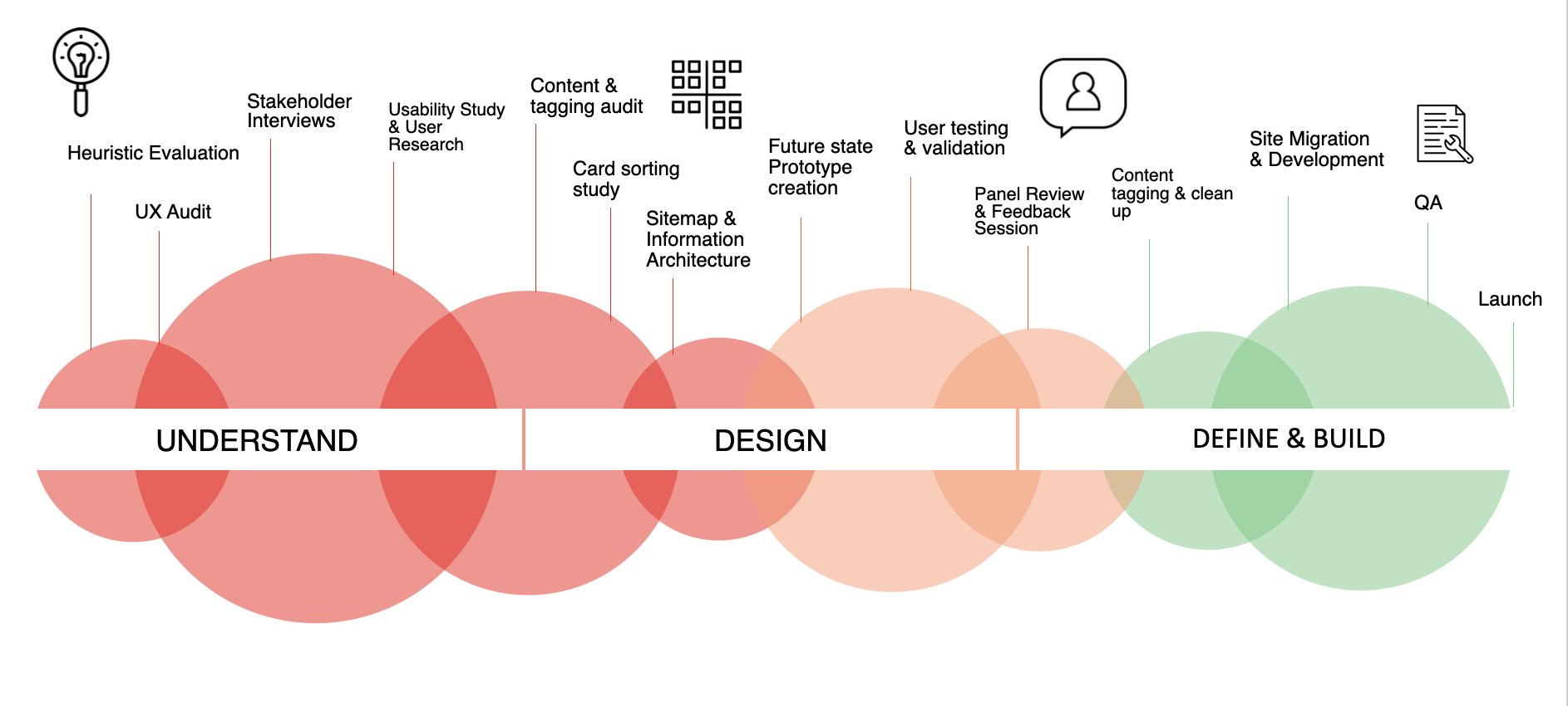
The Coca-Cola Freestyle intranet serves as a file repository and resource for employees to get important information about the Freestyle machine line. Different business functions utilized the platform to support their different activities. Basically, it’s the spot for all Coca-Cola employees that work with Freestyle dispensers to learn and share resources both internally and externally. The Marketing team was aware the site needed work but wasn't clear on just what needed to be done so we kicked things off with research to assess the current state. This included:
Conducted 10 IDIs to understand users pain points and needs for the website. We observed them as they navigated the site.
Assessed specific user flows and discovery to get a baseline usability score for the current site experience.
Identification of usability violations based on the 10 usability heuristics.
Used Optimal Sort sent to website users to assess the current information architecture.

Individuals who are a part of a specific function and are tasked with writing and visualizing the content to be shared out to Freestyle users. They work directly with content uploaders.
The individuals are the site users. They access the site to search for and obtain specific information on Freestyle based on their use case.
The Coca-Cola Freestyle team is made up of different "functions" or what is more typically known as departments. In our recruitment we ensured that we talked to folks from each of these areas - analytics, finance, sales, marketing, and operations. We identified differing user types:
Individuals who are in a leadership role of one of the functions. They review content and are tasked with uploading via the CMS. They produce the name, select tags, and category.
Note that some users can span across these archetype roles. For example a content uploader could also be a content user.
To get a better understanding of what was working and areas for improvement with the current intranet experience we conducted research to identify user needs. We conducted 1:1 interviews and usability testing to gather insights. We found that:
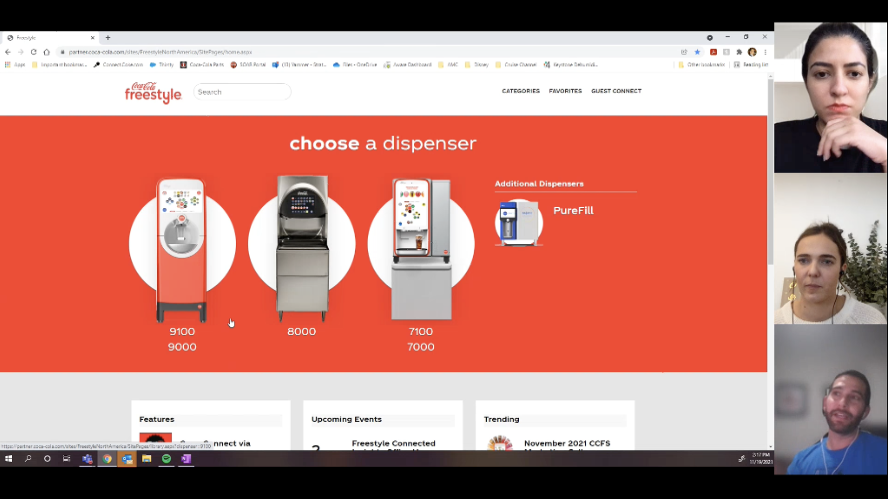
Users were on Teams, Sharepoint, and working in PowerPoint all throughout the day. Microsoft tools were their thing. The Freestyle website, however, didn't integrate as it was a custom built site on a different platform. The systems weren't integrated which made it less appealing for users to visit.
Users weren't able to preview the resources available on the site. And there were lists with 100s of assets available to users. Instead, in order to see if the resource was correct, the user had to download it, open it, view it, and then potentially start the process all over. It required a lot of work and unnecessary time on the users end.
The primary way users were finding resources via search wasn't working. Frustration was noted as we watched individuals struggle to use search effectively. There was a lack of contextual results. Zero-query recommendations didn't exist. Seemingly related words weren't connected which rendered some search results inaccurate. For example, if a user searched for the word "filter" content related to filtration cartridges would not appear.
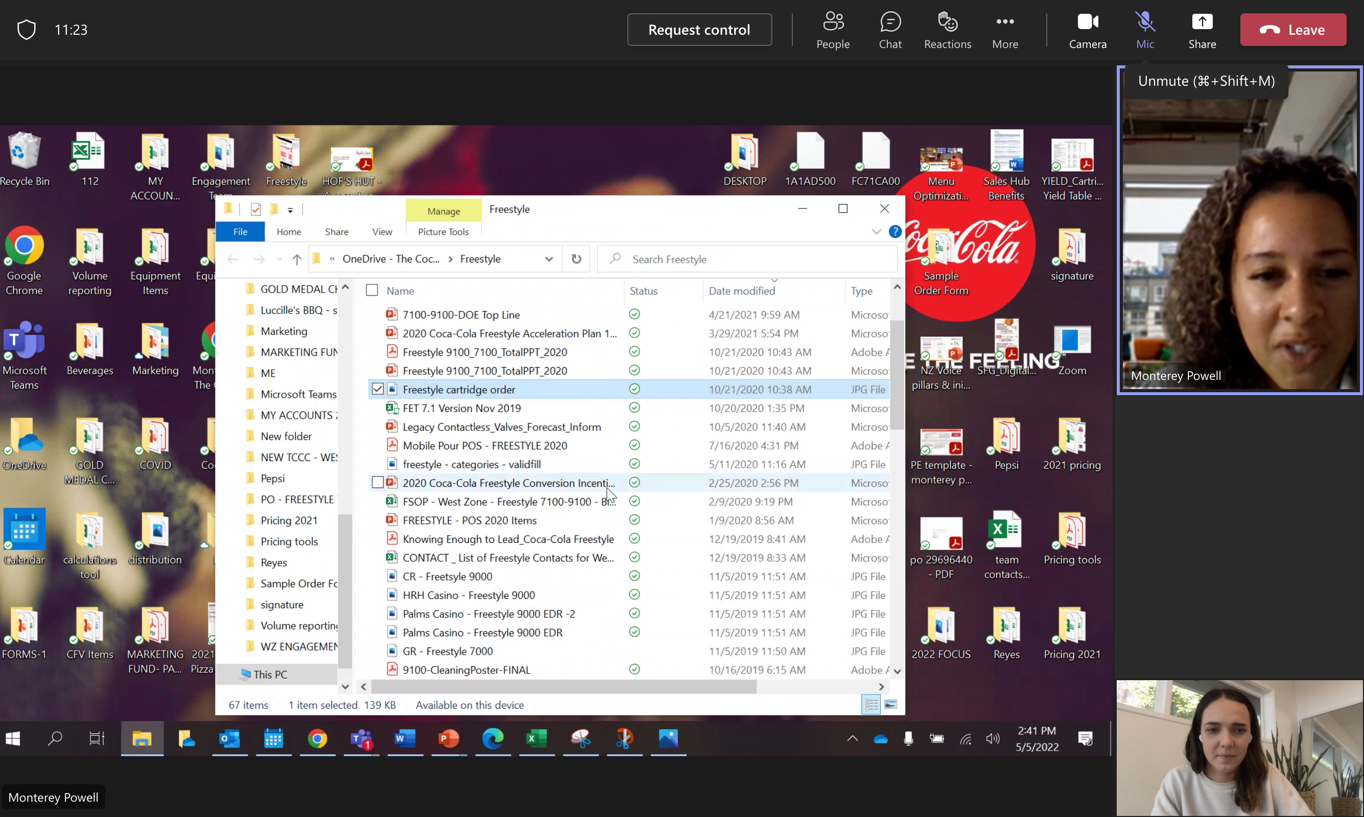
Finding resources was difficult as mentioned. Users showed us how they created files on their desktop with key resources saved so they didn't have to relocate them on the site. We discovered that people were actively avoiding the site.
I conducted user testing after creating the first version of the redesigned prototype in Figma. I scheduled sessions with 8 users from varying functions just like with the interviews. This step helped me discover areas in the design that I needed to rework and iterate on early. Key learnings were:
Since the new website would be built within SharePoint, I worked with an analyst to ensure all of the existing content that hadn't been archived was migrated to the new website with updated tagging, naming conventions, and categorization. Together we reviewed 100s of documents and built a comprehensive spreadsheet with the data. Within the spreadsheet we added data around refresh intervals. Respective Content Reviewers and Uploaders were linked and notifications were triggered to let them know when they needed to review content.
This project had multiple types of research involved. I feel that each method helped to refine the final output ensuring that it met user needs. Below you'll find highlights from the redesign.
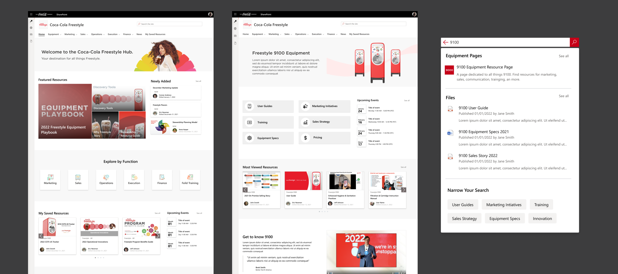
A search experience that serves up results based on users role, previous queries, and saved resources.
A search experience that serves up results based on users role, previous queries, and saved resources.
A search experience that serves up results based on users role, previous queries, and saved resources.
The design changes led to a dramatic improvement in usability scores from our initial usability testing.
- Research is critical to design success. Incorporating rounds of usability testing allowed me to stay nimble and iterate synchronously.
- Being clear with developer files saves meeting time and redundancies but sometimes meetings with 1:1 discussion are needed to communicate the vision clearly.
- Content governance is a big effort. Changing the status quo takes time. It's important to remember that it doesn't have to be perfect from the get-go, things take time to learn.
© Katey Jacobsen 2023. All Rights Reserved.
